
Photo by Dekler Ph on Unsplash
Overview
This case study shows how I used lean design techniques—in particular, iterative research, prototyping and testing—to help a product team incrementally learn about the usability of a novel audio processing technology. This technology makes it easier to hear the most important audio element of a movie or TV show—the spoken dialogue—on a mobile device in suboptimal listening conditions (like a noisy bus).
The outcome of this project was an app that allows users to explore the benefits of this technology and configure it for their personal circumstances. Along the way, we learned how users think about our technologies and how even complex ideas can be effective when presented simply.


My Role
As the design lead I worked closely with the product manager, science lead, engineering leads and other designers. My responsibilities included:
As team lead:
Visual, UI and motion design
Usability testing and research
Prototyping
Copy writing
As primary contributor:
Design strategy and planning
User research
Information architecture
Interaction design
Design Strategy and Planning
Overall, this project took about 12 months from initial concept to GA, with the design work occurring in two phases:
Phase 1: Create a series of prototypes to test our hypotheses about the problem and our solution. The bulk of research and design was in this phase.
Phase 2: Incorporate the lessons from these prototypes into the design of the final product.
User Research
Our target users are consumers that watch movies and TV shows on a mobile device outside of their home. My research sought to understand what people were watching, when and in what context, and also what issues prevented them from fully enjoying the content.
Using a combination of qualitative interviewing, contextual inquiry, and surveys, I learned that participants primarily watched short-form content (episodic TV shows and user-generated content) on their phones whilst travelling. They often struggled to clearly hear the spoken dialogue which made it harder to enjoy the show. They solved this by either turning the volume up to dangerously loud levels or turning on closed captions. However, both of these solutions caused additional problems which further detracted from the experience.
To be successful, our product would have to make it easy for people to clearly hear the dialogue of their favourite shows without introducing other issues.
Design Phase 1: Prototyping
We now had some validation that we’d found a real problem that people had, and a technology that we thought could solve it. To see if we were right, we built and tested a series of prototypes:
Low fidelity prototype (to test the general solution and high-level IA and IxD)
Mid fidelity prototype (to test the onboarding flow)
High fidelity Wizard of Oz prototype (to test the underlying technology)
Low-fidelity Prototype
I started ideating the information architecture and high-level interactions of the prototype with sketches and interactive Balsamiq mockups. This allowed me to get early feedback from the team and internal testers without getting bogged down in details.
Early UI sketches
One of 31 screens from an early clickable prototype
Mid-fidelity Prototype
My early tests showed we were on the right path. Next, I developed a mid-fidelity prototype in Framer which allowed me to explore and test the interactions in more detail. I focused on the onboarding process, especially some of the early microinteraction and motion design ideas. This also allowed me to play with visual design concepts.
Developing an interactive prototype in Framer
Crafting sophisticated microinteractions in JavaScript
Excerpt from a video of the mid-fi prototype
Wizard of Oz Prototype
The results from testing the mid-fi prototype allowed us to fix usability issues with both the onboarding flow and interaction model. But it was still hard to know if users truly understood how the controls worked since the prototype lacked any audio. So next we made a fully functional prototype.
Implementing the real audio processing technology would take significant engineering effort. So, to save time, we built a Wizard of Oz prototype. By pre-rendering audio clips for every combination of settings, we created a very realistic looking (and sounding!) prototype that would give us critical feedback before investing heavily in engineering.
I refined the mid-fi mockups into pixel-perfect visual designs with accompanying style guide, redlines, and interaction models. Working with an external agency, we built the prototype and prepared for an extensive round of research and testing.
Research and Usability Testing
Now that we had a prototype which demonstrated the full user experience we could focus on in-depth user research and usability testing. I ran four research sprints mostly focused on the onboarding experience since this was critical to successful adoption of the app.
Our questions included:
Can users successfully navigate through the app? If not, why not?
What critical and non-critical errors do users run into?
Do users understand the terminology and the purpose of the app? How could we make it easier to understand?
How long does it take to complete onboarding? Where could we improve efficiency?
What audio preferences do users have? Do users understand how they work?
Is this app desirable? Would people use it?
I answered these questions through qualitative and quantitative assessment in a combination of moderated and unmoderated sessions. I wrote the test protocol, including goals, methodology, screener questionnaire, test tasks and script, and reviewed it with the product and design team. To help analyse and present the data, I co-opted a research assistant, mentoring them through the process of gathering and analyzing the data.
Results
The testing showed that, whilst we met our goal of helping people setup the app correctly, users didn’t always understand how the technology benefitted them. Also, the onboarding took too long and users complained about having to setup everything at once. Most users had only one or two use cases that were important to them.
I presented the results as a topline report, including a summary of findings and recommendations as well as the ever-informative highlight video, to the product team.


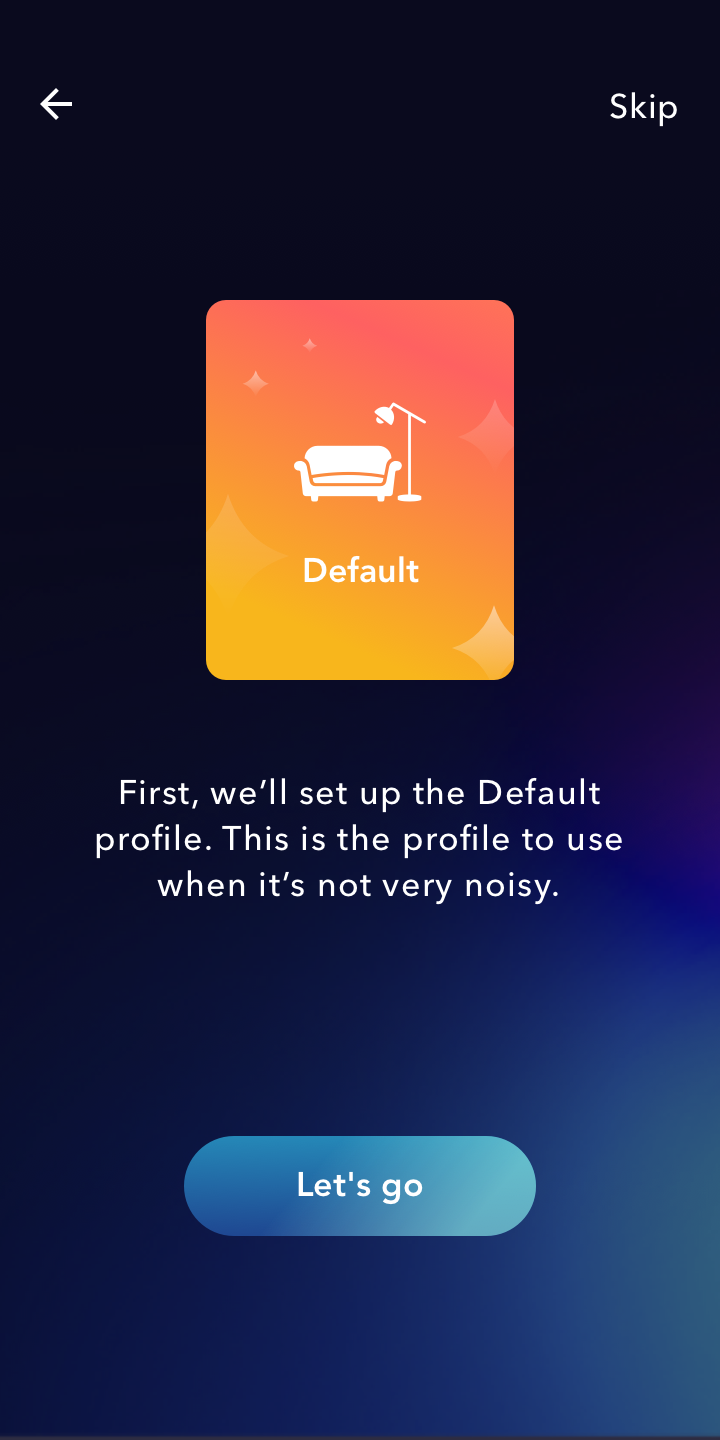
Design Phase 2: General Availability
We took our lessons from testing the prototypes, fixed the most pressing usability issues, and added an updated visual design for the GA release. I focused on the UX improvements whilst a colleague focused on the visual design. This ended up being a great collaboration as we built on each other’s ideas for the visual language and interaction design.
After getting sign-off from our stakeholders, we created the style guide, redlines, and assets for engineering. The last step was working with a copyeditor to refine the language used in the app, ensuring consistency with our brand voice, tone and market messaging.


Outcome
This project was a major success, in several ways:
We landed design wins with several major cellphone manufacturers and the technology became a core feature of Dolby’s mobile platform.
It led to a patent filing.
We forged a new alliance between the Science and Design teams which we continue to build on through several new initiatives.
We set a new bar for what is considered good design—and good design process—at Dolby. Lean design is becoming the established way of learning through rapid iteration and experimentation.