
Photo from Amazon.com
Overview
When the Kindle Scribe—Amazon’s first e-reader that you can write on—was launched, early customer feedback was positive but revealed several features customers wished they had. One of these was for a more extensive selection of writing tools. My team was tasked with adding these in the first fast-follow release for the device.
To do this, I would have to call on all my skills as a designer and technologist—interaction design, rapid prototyping, UI design, usability testing—and learn a few more skills on the way, such as dithering techniques, splines, curve modeling, and brush stroke replication.
“The fountain pen means you can create stunning calligraphy.”

🌟 Project Highlights
Shipped four new expressive writing tools on Kindle Scribe in a 10-week timeline
Led cross-functional design, prototyping, and tuning efforts across UX, engineering, and research
Designed brush stroke aesthetics using splines, dithering, and curve modeling for realistic tools
Prototyped and validated rendering algorithms in React for rapid iteration
Built custom tooling for analysing stroke data
Captured & analyzed over 2,000,000 stylus data samples from 40 diverse participants
Outcome: Launched a high-quality, user-loved feature on schedule, praised by customers and leadership
My Role
I was the design lead and technologist for this project. I worked closely with the product manager, user research, engineers, and other designers. My responsibilities included:
Writing tool selection and definition
Rendering algorithm design and prototyping
Parameter tuning and testing
Toolbar UX and UI, including iconography
The Project
Defining the new writing tools
The device originally shipped with one pen and a highlighter. By combining the results of two internal studies I ran together with data from a beta study, I worked with the Product Manager to prioritise the number and type of writing tools we would need:
A pencil
A marker pen
A fountain pen
A brush pen
I had to figure out what each tool would look like: its pattern, shape, and stroke width options. I also had to design how it would respond to the user’s gestures via the stylus (tilt, pressure, velocity, writing direction, etc.).
Design Principles
To deliver a natural and expressive writing experience on Kindle Scribe, I guided my work with three principles:
Expressive fidelity
Each tool should capture the authentic feel of its physical counterpart so that users instantly recognize and trust the experience.
Responsive authenticity
Stylus inputs (pressure, tilt, velocity, direction) should translate seamlessly into visible marks with minimal latency, ensuring that user intent is respected and creative flow is maintained.
Effortless simplicity
Despite the technical complexity underneath, the interaction should feel intuitive, calm, and unobtrusive, so the user can stay focused on their ideas rather than on managing the tool.
Exploration
My initial exploration focused on two areas:
I explored both analogue and digital versions of these tools. I made a lot of pencil marks and fountain pen strokes, and I tried many brush pens and markers. I also looked at similar tools in other apps and devices. With this, I characterised the attributes that gave each tool its unique look and feel.
I worked with engineering to understand how the Kindle Scribe rendered the existing pen and highlighter strokes. This would allow me to experiment with algorithms that could generate realistic equivalents for the new tools.
Prototyping the algorithms
With an idea of how I wanted each new tool to look and behave, I needed to explore how this could be achieved on the Kindle Scribe itself. Engineering didn’t yet have the capacity to create a prototype on the device, so I developed a browser-based prototype using React.
I was able to iterate quickly, trying different algorithms, parameters and stylus response models to find an approach I could then review with engineering, PM and other designers for technical and aesthetic feasibility.

Tuning the parameters
With alignment on the rendering algorithms to use, engineering was able to build a prototype that could run on the device so that I could tune how the new writing tools would respond to the pressure and tilt of the stylus.
An essential aspect of the tuning process was ensuring the writing tools worked well for every user and their unique writing style. In particular, I’d need to account for how users held the stylus (at what angle relative to the screen) and how much pressure they applied when writing.
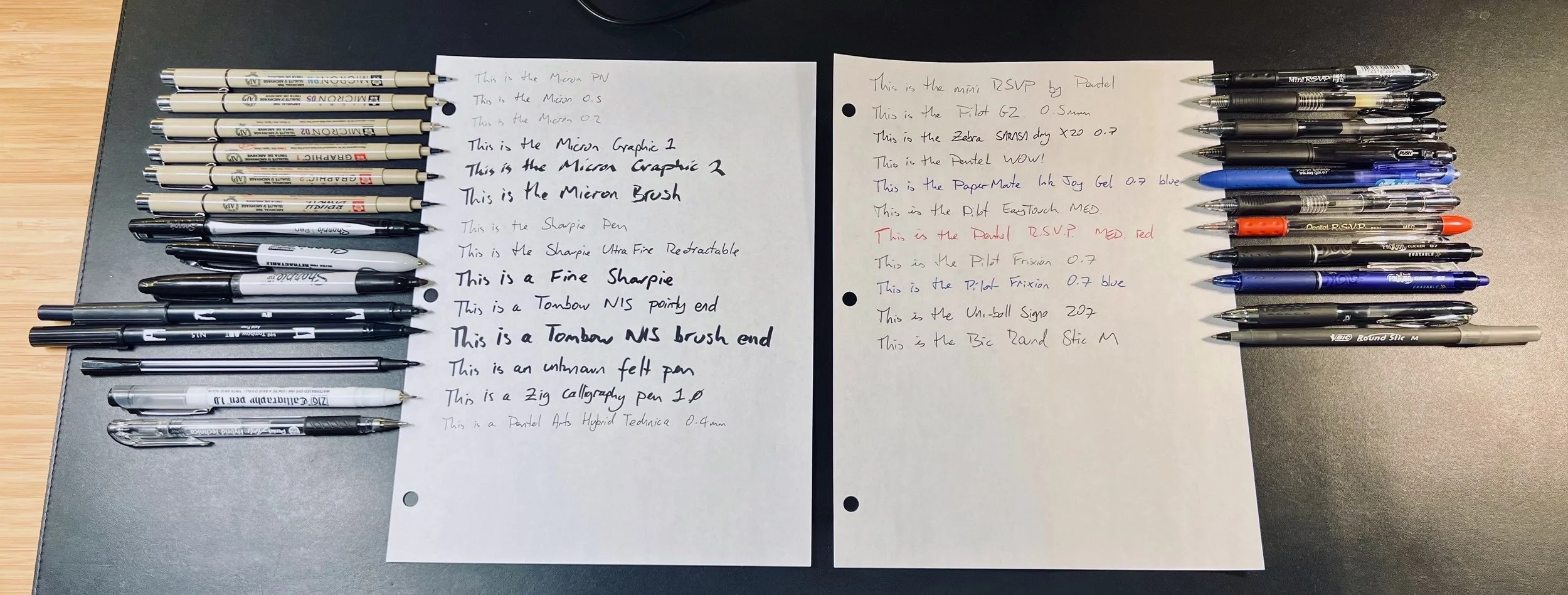
To understand this better, I ran a study that captured over 200k samples of raw stylus data from 30 users whilst they wrote on the device, covering both left and right-handed writers of various languages.
I analysed the data using Python statistical library pandas in Jupyter Lab. I calculated a variety of descriptive statistics, which allowed me to determine the sweet spot for the 50 or so parameters that define each writing tool. I also created tests for the stylus response curves to verify that the parameters stayed within their sweet spots as I adjusted them.
“The pencil tool is especially nice. It has an excellent pressure curve, and the tilt support allows for subtle shading.”


The Toolbar UI
I also needed to update the writing toolbar UI so people could use the new writing tools. I created a dozen concepts for the layout, interaction design, and iconography, reviewed and tested them internally, and narrowed them down to the final design.

Testing
The team ran a beta test of the new writing tools and the toolbar UI. The results showed that whilst overall response was positive (everyone—including our VP—loved the new fountain pen!), two of the new pens didn’t score well: the marker and the brush pen. Testers complained that there wasn’t enough distinction between the two and that they didn’t understand what a “brush pen” was. So, after discussions with the PM and the broader leadership team, we decided to cut the brush pen from this release.
The new toolbar UI performed very well and needed no changes before launch.
“The fountain pen is phenomenal. This graphite pencil...blows the competition out of the water. Absolutely, spectacularly good!”

Retrospective
The primary constraint for this project was the short time frame. This impacted us in several ways:
We had to reduce the scope of the release and make some painful cuts. But this helped us focus on delivering the highest value features first.
It limited our ability to explore different algorithmic approaches in the early stages, so we had to make long-term decisions with fewer data than I would’ve liked.
Similarly, I wish we had more time for testing and tuning. We only had time for one large-scale test, and I would’ve loved more writing data samples to give us higher confidence in our design decisions.
Ideally, I would’ve developed my prototype on the Kindle Scribe directly rather than in the browser. But, I had never developed for the Kindle platform before, so I stuck with familiar technologies for speed.
But despite the crunch, we hit our deadlines and launched one of the most requested customer features at a high quality and on time.